Building Web Sites All-in-One For Dummies® (18 page)
Read Building Web Sites All-in-One For Dummies® Online
Authors: Claudia Snell

â¢
Use images and multimedia elements thoughtfully.
Don't include an element just because you like it. Make sure it fits your content. If your site is about cacti, find pictures of cacti. Include a chart of care statistics or create a short, multimedia presentation about how to care for cacti. Leave the pictures of kittens off the page about cacti. They might be cute, but an image that is there for no other reason than that it's cute makes your page look amateurish.
 Especially, use Flash and other multimedia with care. Plan and develop each piece of multimedia, whether it's a Flash presentation or a video, making sure it conveys information in addition to being nice to look at. If you expect your users to wait for media to download, make it worth their time. (You can find more about developing and using multimedia elements in Book V.)
Call to action
You'll likely hear the term
call to action
when you start working with Web sites. This term refers to the practice of soliciting an overt direction from your visitors:
Click here
or
Order now
.
A call to action is generally used along with some explanation to visitors about why they would want to follow your directions. You can drive traffic very effectively by using a call to action.
Click here for sale prices
is sure to catch viewers' attention and get them to follow the link.
When you don't use a call to action, you're leaving your visitors to decide what they'd like to do next on their own. If your content is confusing enough or if your navigational elements don't look like navigation (links that are hidden), your users have no idea what they're expected to do. They might leave the site in favor of a site that helps them find what they need.
Chapter 4: Ensuring Visual Appeal
In This Chapter
Understanding colors on Web sites
Getting to know JPEGs and GIFs
Choosing font families
Buying stock images
Refreshing an existing site
As you start to work on the visual aspects of your site â also known as the
look and feel
â you have to make a few decisions. You have to choose colors and imagery that support your message and convey a sense of what your organization is about. In some cases, you might have to buy images to use. You might also have to work with existing printed materials. You have many details to tend to, but don't let that overwhelm you. Within a short period of time â and with the help of this chapter â getting the artwork under control will become second nature to you.
Colors on the Web
One of the first things you might encounter is a situation where an organization already has printed materials and is looking to enhance its presence with a Web site. The printed materials might have a look and feel already established and most certainly will have a logo and color scheme in place.
Here's something to always bear in mind:
Color on the Web is different than color on paper.
This might sound like an obvious statement, but it actually isn't. Color in printed materials is represented by a system called CMYK (
c
yan,
m
agenta,
y
ellow, and blac
k
). In short, it refers to the colors of ink that are used when printing. Web pages and Web graphics don't use CMYK; they use a system called RGB (
r
ed,
g
reen,
b
lue), which is represented in HTML, CSS, and other Web scripts with hexadecimal code. More on that later in this chapter. In order to understand
why
it is important that the color systems are different, you need a bit of information about
how
the color systems are different.
CMYK color
As we mention, CMYK is the color system used to produce printed materials. It refers to the colors of ink that are used to print things. CMYK is a
subtractive color system,
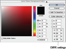
in which everything starts off white. White is the color you get when all the colors are being reflected back to your eye from a surface. Subtractive colors absorb, or subtract, some of the color in the light, which creates the effect of colors. CMYK colors are represented by percentages of how much of each ink color are to be used. The Photoshop Color Picker window shown in Figure 4-1 features the CMYK settings.
Figure 4-1:
The Color Picker, showing CMYK settings.
RGB color
Red, green, and blue are the primary colors of light. Because computer monitors use light to display colors on-screen, the RGB system is what computers use. RGB is an
additive color system,
which means that you add different amounts of red, green, and blue to create colors. Black is the absence of light, and so is the absence of color in the RGB system. When you add different values of the three primaries, you get different colors. RGB colors are represented as numbers between 0 and 255 â one number for each R, G, and B. Zero means that none of that color exists, and 255 is the maximum amount of the color that can exist. So, for example,
0, 0, 245
represents a very blue color (0 for the value of red, 0 for the value of green, and 245 for the value of blue).
Hexadecimal colors
Hexadecimal colors are how browsers like to interpret color. When you're using HTML or CSS code to produce colors, you will, most likely, use hexadecimal colors to do it. You can use other methods of displaying colors (such as using color names), but hexadecimal is the preferred standard. Hexadecimal (
hex,
for short) uses six digits or letters to display colors. For example, #000000 is the Hexadecimal code for black. These digits are read as three pairs of numbers; the first pair represents the amount of red in the color, the second pair represents the amount of green in the color, and the third pair (you guessed it right) represents the amount of blue. You use hexadecimal colors for background colors, font (typeface) colors, and link colors.
 Computer monitors use light to display images, so RGB is what they read. Hexadecimal is just a way to communicate with the browser about what color you want a Web element to be.
To find out more about using hexadecimal in code, refer to Book III, Chapters 2 and 3, where we cover HTML and CSS.
Making nice with established color schemes
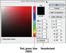
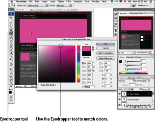
If you're going to design graphics for an organization that has a color scheme already in place, you must have them supply the correct RGB or hexadecimal values that correspond to the CMYK colors they're already using; otherwise, you might not get the colors right. We don't recommend “just using the eyedropper,” as some print designers might tell you to do. The Eyedropper tool in Photoshop is called that because that's what it looks like. The purpose of it is to get a sample of a color within your document. It is used by clicking the area you'd like a sample of within a Photoshop document. You'll see the Eyedropper in action in the next section. The colors often shift or aren't accurate when you use that method. A best practice is to get the colors straight from the client so that you're sure they're what the client wants. In Figure 4-2, you can see the different color systems available for you to work with in Photoshop.
Figure 4-2:
The Color Picker offers color system choices.
Despite your best efforts, though, a subtle shift in colors is likely to occur. You can't perfectly match the colors of a brochure to the colors on the computer screen. The reasons for this are that the appearance of the colors on the brochure change depending on the lighting conditions in the room, and every computer monitor is a little different. If you hold the brochure up next to the monitor and work at it, you might get them to match visually. As soon as you go to a different monitor or change the lighting in the room, though, they won't match any more. In other words, if you're trying to match perfectly, don't. You can get them close enough so they'll be consistent, and that should be the goal. The way to do that is to make sure you get the right RGB or hex colors from the client. Figure 4-3 shows using the Eyedropper tool in Photoshop.
Figure 4-3:
The Eyedropper tool's great, but get the right RGB or hex colors.
Web-safe colors
In addition to RGB and hexadecimal colors, you hear about
Web safe
or the
Web 216
palette.
Web safe
and
Web 216
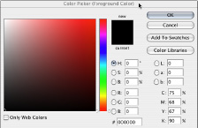
refer to the set of 216 colors that display reliably across the different platforms. The use of Web-safe colors was more important years ago when people didn't have computers and monitors that could handle millions of colors. A system was developed to make sure that colors could be displayed correctly on both Mac and Windows computers. With today's standards for computers and monitors, it's becoming increasingly mainstream to disregard strict adherence to the Web-safe, 216-color palette. Figures 4-4 and 4-5 illustrate the difference between a Web-safe, 216-color palette (Figure 4-4) and a nonâWeb-safe palette (Figure 4-5).
Figure 4-4:
The Web-safe palette.
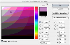
Figure 4-5:
The Color Picker window displaying full color.
Although in many cases, you can pick colors without worrying too much about strict adherence to the Web 216 (Web-safe, 216-color) palette, sometimes you need to. One of those times is when you're making a graphic that needs to sit next to an expanse of code-generated color â for instance, in a banner. If you want to match the background color of the banner and the color in a graphic sitting over the background color, you should use a Web-safe color. That way, you can be sure there isn't a slight color shift between the graphic and the background.
Color shift
is what happens when two colors that should be the same are very slightly off. A color shift between a graphic and the background can be slight to severe but is always distracting. See the example in Figure 4-6 to see how this can produce undesirable results.