CSS: The Definitive Guide, 3rd Edition (22 page)
Read CSS: The Definitive Guide, 3rd Edition Online
Authors: Eric A. Meyer
Tags: #COMPUTERS / Web / Page Design

Now let's look at ways to manipulate the capitalization
of text using the propertytext-transform.
text-transform
- Values:
uppercase|lowercase|capitalize|none|inherit- Initial value:
none- Applies to:
All elements
- Inherited:
Yes
- Computed value:
As specified
The default valuenoneleaves the text alone and
uses whatever capitalization exists in the source document. As their names imply,uppercaseandlowercaseconvert text into all upper- or lowercase characters. Finally,capitalizecapitalizes only the first letter of
each word.
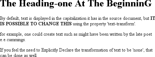
Figure 6-24
illustrates each of
these settings in a variety of ways:
h1 {text-transform: capitalize;}
strong {text-transform: uppercase;}
p.cummings {text-transform: lowercase;}
p.raw {text-transform: none;}
The heading-one at the beginninG
 By default, text is displayed in the capitalization it has in the source
document, but it is possible to change this using
the property 'text-transform'.


For example, one could Create TEXT such as might have been Written by
the late Poet e.e.cummings.


If you feel the need to Explicitly Declare the transformation of text
to be 'none', that can be done as well.

Figure 6-24. Various kinds of text transformation
Different user agents may have different ways of deciding where words begin and, as a
result, which letters are capitalized. For example, the text "heading-one" in theh1element, shown in
Figure 6-24
, could be rendered in one of two
ways: "Heading-one" or "Heading-One." CSS does not say which is correct, so either is
possible.
You probably also noticed that the last letter in theh1element in
Figure 6-24
is
still uppercase. This is correct: when applying atext-transformofcapitalize, CSS only
requires user agents to make sure the first letter of each word is capitalized. They can
ignore the rest of the word.
As a property,text-transformmay seem minor, but
it's very useful if you suddenly decide to capitalize all yourh1elements. Instead of individually changing the content of all yourh1elements, you can just usetext-transformto make the change for you:
h1 {text-transform: uppercase;}
This is an H1 element
The advantages of usingtext-transformare
twofold. First, you only need to write a single rule to make this change, rather than
changing theh1itself. Second, if you decide later
to switch from all capitals back to initial capitals, the change is even easier, as
Figure 6-25
shows:
h1 {text-transform: capitalize;}
This is an H1 element

Figure 6-25. Transforming an H1 element
Next we come totext-decoration, which is a fascinating property that
offers a whole truckload of interesting behaviors.
text-decoration
- Values:
none| [underline||overline||line-through||blink] |inherit- Initial value:
none- Applies to:
All elements
- Inherited:
No
- Computed value:
As specified
As you might expect,underlinecauses an element
to be underlined, just like theUelement in HTML.overlinecauses the opposite effect—drawing a line
across the top of the text. The valueline-throughdraws a line straight through the middle of the text, which is also known as
strikethrough text
and is equivalent to theSandstrikeelements in
HTML.blinkcauses the text to blink on and off, just
like the much-malignedblinktag supported by
Netscape.
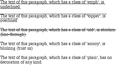
Figure 6-26
shows examples of each
of these values:
p.emph {text-decoration: underline;}
p.topper {text-decoration: overline;}
p.old {text-decoration: line-through;}
p.annoy {text-decoration: blink;}
p.plain {text-decoration: none;}

Figure 6-26. Various kinds of text decoration
It's impossible to show the effect ofblinkin
print, of course, but it's easy enough to imagine (perhaps all too easy).
Incidentally, user agents are not required to supportblink, and as of this writing, Internet Explorer never has.
The valuenoneturns off any decoration that might
otherwise have been applied to an element. Usually, undecorated text is the default
appearance, but not always. For example, links are usually underlined by default. If you
want to suppress the underlining
of hyperlinks,
you can use the following CSS rule to do so:
a {text-decoration: none;}
If you explicitly turn off link underlining with this sort of rule, the only visual
difference between the anchors and normal text will be their color (at least by default,
though there's no ironclad guarantee that there will be a difference in their colors).
Although I personally don't have a problem with it, many users are annoyed when
they realize you've turned off link underlining. It's a matter of opinion, so let
your own tastes be your guide, but remember: if your link colors aren't sufficiently
different from normal text, users may have a hard time finding hyperlinks in your
documents.
You can also combine decorations in a single rule. If you want all hyperlinks to be
both underlined and overlined, the rule is:
a:link, a:visited {text-decoration: underline overline;}
Be careful, though: if you have two different decorations matched to the same
element, the value of the rule that wins out will completely replace the value of the
loser. Consider:
h2.stricken {text-decoration: line-through;}
h2 {text-decoration: underline overline;}
Given these rules, anyh2element with a class ofstrickenwill have only a line-through decoration.
The underline and overline decorations are lost, since shorthand values replace one
another instead of accumulating.
Now, let's look into the unusual side oftext-decoration. The first oddity is thattext-decorationis
not
inherited.
No inheritance implies that any decoration lines drawn with the text—under, over, or
through it—will be the same color as the parent element. This is true even if the
descendant elements are a different color, as depicted in
Figure 6-27
:
p {text-decoration: underline; color: black;}
strong {color: gray;}
This paragraph, which is black and has a black underline, also contains
strongly emphasized text which has the black underline
beneath it as well.

Figure 6-27. Color consistency in underlines
Why is this so? Because the value oftext-decorationis not inherited, thestrongelement assumes a default value ofnone. Therefore, thestrongelement has
no
underline. Now, there is very clearly a line under thestrongelement, so it seems silly to say that
it has none. Nevertheless, it doesn't. What you see under thestrongelement is the paragraph's underline, which is
effectively "spanning" thestrongelement. You can
see it more clearly if you alter the styles for the boldface element, like this:
p {text-decoration: underline; color: black;}
strong {color: gray; text-decoration: none;}
This paragraph, which is black and has a black underline, also contains
strongly emphasized text which has the black underline beneath it as
well.
The result is identical to the one shown in
Figure 6-27
, since all you've done is to explicitly declare what was
already the case. In other words, there is no way to turn off underlining
(or
overlining or a line-through) generated by a parent element.
Whentext-decorationis combined withvertical-align, even stranger things can happen.
Figure 6-28
shows one of these oddities.
Since thesupelement has no decoration of its
own, but it is elevated within an overlined element, the overline cuts through the
middle of thesupelement:
p {text-decoration: overline; font-size: 12pt;}
sup {vertical-align: 50%; font-size: 12pt;}

Figure 6-28. Correct, although strange, decorative behavior
By now you may be vowing never to use text decorations because of all the problems
they could create. In fact, I've given you the simplest possible outcomes since we've
explored only the way things
should
work according to the
specification. In reality, some web browsers do turn off underlining in child
elements, even though they aren't supposed to. The reason browsers violate the
specification is simple enough: author expectations. Consider this markup:
p {text-decoration: underline; color: black;}
strong {color: silver; text-decoration: none;}
This paragraph, which is black and has a black underline, also contains
boldfaced text which does not have black underline
beneath it.
Figure 6-29
shows the display in a web
browser that has switched off the underlining for thestrongelement.

Figure 6-29. How some browsers really behave
The caveat here is that many browsers
do
follow the
specification, and future versions of existing browsers (or any other user agents)
might one day follow the specification precisely. If you depend on usingnoneto suppress decorations, it's important to realize
that it may come back to haunt you in the future, or even cause you problems in the
present. Then again, future versions of CSS may include the means to turn off
decorations without usingnoneincorrectly, so
maybe there's hope.
There is a way to change the color of
a decoration without violating the specification. As
you'll recall, setting a text decoration on an element means that the entire element
has the same color decoration, even if there are child elements of different colors.
To match the decoration color with an element, you must explicitly declare its
decoration, as follows:
p {text-decoration: underline; color: black;}
strong {color: silver; text-decoration: underline;}
This paragraph, which is black and has a black underline, also contains
strongly emphasized text which has the black underline
beneath it as well, but whose gray underline overlays the black underline
of its parent.
In
Figure 6-30
, thestrongelement is set to be gray and to have an
underline. The gray underline visually "overwrites" the parent's black underline, so
the decoration's color matches the color of thestrongelement.

Figure 6-30. Overcoming the default behavior of underlines