CSS: The Definitive Guide, 3rd Edition (40 page)
Read CSS: The Definitive Guide, 3rd Edition Online
Authors: Eric A. Meyer
Tags: #COMPUTERS / Web / Page Design

In the old days, if
you wanted some kind of "sidebar" background, you had to create a very short but
incredibly wide image to place in the background. At one time, a favorite size for
these images was 10 pixels tall by 1,500 pixels wide. Most of that image would be
blank space, of course; only the left 100 or so pixels contained the "sidebar" image.
The rest of the image was basically wasted.
Wouldn't it be much more efficient to create a sidebar image that's 10 pixels tall
and 100 pixels wide, with no wasted blank space, and then repeat it only in the
vertical direction? This would certainly make your design job a little easier, and
your users' download times a lot faster. Enterbackground-repeat.
background-repeat
- Values:
repeat|repeat-x|repeat-y|no-repeat|inherit- Initial value:
repeat- Applies to:
All elements
- Inherited:
No
- Computed value:
As specified
As you might guess,repeatcauses the image to
tile in both the horizontal and vertical directions, just as background images have
always done in the past.repeat-xandrepeat-ycause the image to be repeated in the
horizontal or vertical directions, respectively, andno-repeatprevents the image from tiling
in any direction.
By default, the background image will start from the top-left corner of an
element. (We'll see how to change this later in the chapter.) Therefore, the
following rules will have the effect shown in
Figure 9-17
:
body {background-image: url(yinyang.gif);
background-repeat: repeat-y;}
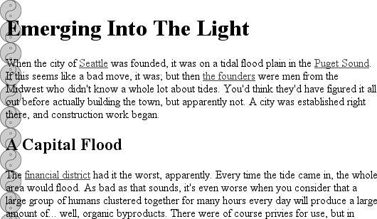
Figure 9-17. Tiling the background image vertically
(I've left out a background color in order to keep the rule short, but remember to
include one any time you have a background image.)
Let's assume, though, that you want the image to repeat across the top of the
document. Rather than creating a special image with a whole lot of blank space
underneath, you can simply make a small change to your rule:
body {background-image: url(yinyang.gif);
background-repeat: repeat-x;}
As
Figure 9-18
shows, the image is
repeated along the
x
-axis (that is, horizontally) from its
starting position—in this case, the top-left corner of the browser window.
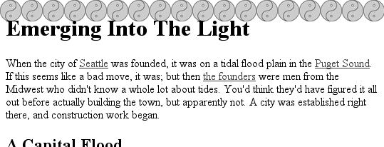
Figure 9-18. Tiling horizontally
Finally, you may not want to repeat the background image at all. In this case, you
use the valueno-repeat:
body {background-image: url(yinyang.gif);
background-repeat: no-repeat;}
This value may not seem terribly useful, given that this declaration would just
drop a small image into the top-left corner of the document, but let's try it again
with a much bigger symbol, as shown in
Figure
9-19
:
body {background-image: url(bigyinyang.gif);
background-repeat: no-repeat;}
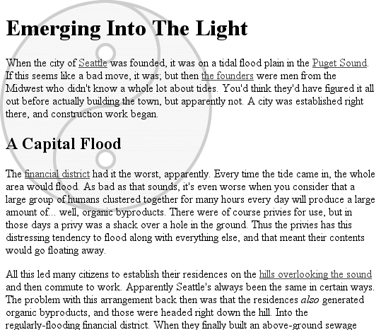
Figure 9-19. Placing a single large background image
The ability to control the repeat direction dramatically expands the range of
possible effects. For example, let's say you want a triple border on the left side of
eachh1element in your document. You can take
that concept further and decide to set a wavy border along the top of eachh2element. The image is colored in such a way that it
blends with the background color and produces the wavy effect shown in
Figure 9-20
:
h1 {background-image: url(triplebor.gif); background-repeat: repeat-y;}
h2 {background-image: url(wavybord.gif); background-repeat: repeat-x;
background-color: #CCC;}
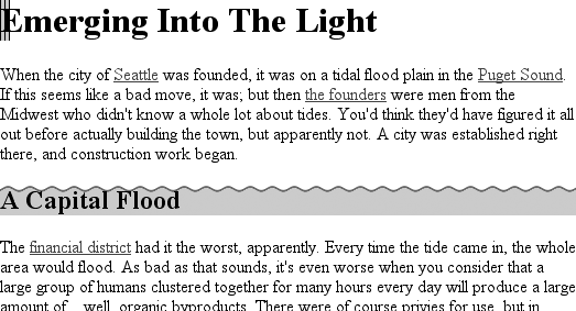
Figure 9-20. Bordering elements with background images
Simply by choosing the appropriate image for the job and employing it in some
creative ways, you can set up some very interesting effects. And that isn't all
that's possible. Now that you know how to constrain a background image's repetition,
how about moving it around in the background area?
Thanks tobackground-repeat, it's possible to place a large image
in the background of a document and then keep it from repeating. Let's add to that
and actually change the image's position in the background.
For example, you could center a background image in thebodyelement, with the result depicted in
Figure 9-21
:
body {background-image: url(bigyinyang.gif);
background-repeat: no-repeat;
background-position: center;}
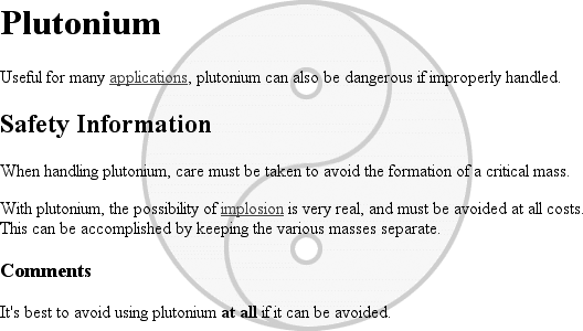
Figure 9-21. Centering a single background image
You've actually placed a single image in the background and then prevented it from
being repeated with the valueno-repeat. Every
background that includes an image starts with a single image that is then repeated
(or not) according to the value ofbackground-repeat. This starting point is called the
origin
image
.
background-position
- Values:
[[
| | left|center|right] [] |
|top|center|bottom]?] ||
[[left|center|right] ||
[top|center | bottom]] |inherit- Initial value:
0% 0%- Applies to:
Block-level and replaced elements
- Inherited:
No
- Percentages:
Refer to the corresponding point on both the element and the origin
image (see explanation in "
Percentage values
" later in this chapter)- Computed value:
The absolute length offsets, if
is specified;
otherwise, percentage values
The placement of the origin image is accomplished withbackground-position, and there are several ways to supply values for
this property. First, there are the keywordstop,bottom,left,right, andcenter. Usually, these appear in pairs, but (as the
previous example shows) this is not always true. Then there are length values, such
as50pxor2cm,
and finally, percentage values. Each type of value has a slightly different effect on
the placement of the background image.
I should mention one more thing: the context in which background images are
placed. CSS2 and CSS2.1 state thatbackground-positionis used to place the origin image with respect to the
padding edge of the element. In other words, the image-placement context is the inner
border edge, even though the background area extends to the outer border edge. Not
every browser places images properly; some place the origin image with respect to the
outer border edge instead of the inner border edge. In any situation where there is
no border, the effect is identical either way.
For those interested in how CSS has changed over the years, CSS1 defined
placement relative to the content area.
Despite image-placement context, a fully tiled background image would indeed fill
in the border area's background because a tiled image extends in all four directions.
We'll talk about this in more detail later. First, you need to find out how the
origin image can be positioned within the element.
The image-placement keywords are easiest to
understand. They have the effects you'd expect from their names; for example,top rightwould cause the origin image to be
placed in the top-right corner of the element's padding area. Let's go back to the
small yin-yang symbol:
p {background-image: url(yinyang.gif);
background-repeat: no-repeat;
background-position: top right;}
This will place a nonrepeated origin image in the top-right corner of each
paragraph's padding. Incidentally, the result, shown in
Figure 9-22
, would be exactly the same if
the position were declared asright top.
Position keywords can appear in any order (according to the specification), as
long as there are no more than two of them—one for the horizontal and one for the
vertical.
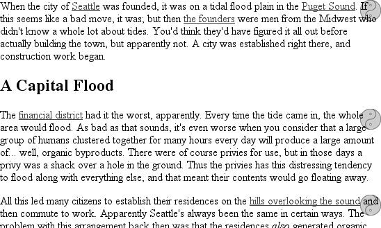
Figure 9-22. Placing the background image in the top right corner of paragraphs
The Netscape 6.x family has a bug that causes it to ignore a rule if thebackground-positionkeywords are in a
particular order. To avoid tripping the bug, make sure your keywords give the
horizontal placement first and then the vertical. Thus, writeleft centerinstead ofcenter left.
If only one keyword appears, then the other is assumed to becenter.
Table
9-1
shows equivalent keyword statements.
Table 9-1. Position keyword equivalents
Single keyword | Equivalent keywords |
|---|---|
|
|
|
|
|
|
|
|
|
|
So if you want an image to appear in the top center of every paragraph, you
need only declare:
p {background-image: url(yinyang.gif);
background-repeat: no-repeat;
background-position: top;}
Percentage values are closely related to the
keywords, although they behave in a more sophisticated way. Let's say that you
want to center an origin image within its element by using percentage values.
That's easy enough:
p {background-image: url(bigyinyang.gif);
background-repeat: no-repeat;
background-position: 50% 50%;}
This causes the origin image to be placed such that its center is aligned with
the center of its element. In other words, the percentage values apply to both the
element and the origin image.
Let's examine the process in closer detail. When you center an origin image in
an element, the point in the image that can be described as50% 50%(the center) is lined up with the point in
the element that can be described the same way. If the image is placed at0% 0%, its top-left corner is placed in the top-left
corner of the padding area of the element.100%causes the origin image's bottom right corner to be placed into the
100%
bottom right corner of the padding area:
p {background-image: url(oransqr.gif);
background-repeat: no-repeat;
padding: 5px;  border: 1px dotted gray;}
p.c1 {background-position: 0% 0%;}
p.c2 {background-position: 50% 50%;}
p.c3 {background-position: 100% 100%;}
p.c4 {background-position: 0% 100%;}
p.c5 {background-position: 100% 0%;}
Figure 9-23
illustrates these rules.
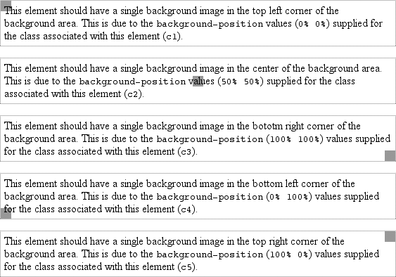
Figure 9-23. Various percentage positions
Thus, if you want to place a single origin image a third of the way across the
element and two-thirds of the way down, your declaration would be:
p {background-image: url(bigyinyang.gif);
background-repeat: no-repeat;
background-position: 33% 66%;}
With these rules, the point in the origin image that is one-third across and
two-thirds down from the top-left corner of the image will be aligned with the
point that is farthest from the top-left corner of the containing element. Note
that the horizontal value
always
comes first with percentage
values. If you were to switch the percentages in the preceding example, the image
would be placed two-thirds of the way across the element and one-third of the way
down.
If you supply only one percentage value, the single value supplied is used as
the horizontal value, and the vertical is assumed to be50%. This is similar to keywords, where if only one keyword is
given, the other is assumed to becenter. For
example:
p {background-image: url(yinyang.gif);
background-repeat: no-repeat;
background-position: 25%;}
The origin image is placed one-quarter of the way across the element's content
area and padding area, and halfway down it, as depicted in
Figure 9-24
.

Figure 9-24. Declaring only one percentage value means the vertical position evaluates
to 50%
Table 9-2
gives a breakdown of
keyword and percentage equivalencies.
Table 9-2. Positional equivalents
Single keyword | Equivalent keywords | Equivalent percentages |
|---|---|---|
|
|
|
|
|
|
|
|
|
|
|
|
|
|
|
| |
|
|
| |
|
|
| |
|
|
| |
|
|
In case you're wondering, the default values forbackground-positionare0% 0%, which is functionally the same astop left. This is why, unless you set different
values for the position, background images always start tiling from the top-left
corner of the element's padding area.