CSS: The Definitive Guide, 3rd Edition (49 page)
Read CSS: The Definitive Guide, 3rd Edition Online
Authors: Eric A. Meyer
Tags: #COMPUTERS / Web / Page Design

nonreplaced elements
In general, the size and placement of an element
depends on its containing block. The values of its various properties (width,right,padding-left, and so on) affect the
situation, but the foundation is the containing block.
Consider the
width and horizontal placement of a positioned element. It can be represented as
an equation stating thatleft+margin-left+border-left-width+padding-left+width+padding-right+border-right-width+margin-right+right= the width of the containing
block.
This calculation is fairly reasonable. It's basically the
equation that determines how block-level elements in the normal flow are sized,
except it addsleftandrightto the mix. So how do all of these interact?
There are a series of rules to work through.
First, ifleft,width, andrightare all set toauto, you get the result shown in the previous
section: the left edge is placed at its static position, assuming a left-to-right
language. In right-to-left languages, the right edge is placed at its static
position. Thewidthof the element is set as
"shrink to fit," which means the element's content area is made only as wide as
necessary to contain the content. This is rather like the way table cells behave.
The non-static-position property (right in left-to-right languages, left in
right-to-left) is set to take up the remaining distance. For
example:
An absolutely positioned element can have its content
shrink-wrapped
thanks to the way positioning rules work.
This
yields the result shown in
Figure
10-44
.

Figure 10-44. The "shrink-to-fit" behavior of absolutely positioned elements
The top of the element is placed against the top of its containing
block (thediv, in this case) and the width of
the element is just as much as is needed to contain the content. The remaining
distance from the right edge of the element to the right edge of the containing
block becomes the computed value ofright.
Now suppose that only the left and right margins are
set toauto, notleft,width, andright, as in this
example:
An absolutely positioned element can have its content
shrink-wrapped
thanks to the way positioning rules work.
What
happens here is that the left and right margins, which are bothauto, are set to be equal. This will effectively
center the element, as shown in
Figure
10-45
.

Figure 10-45. Horizontally centering an absolutely positioned element with auto margins
This is basically the same as auto-margin centering in the normal
flow. So let's make the margins something other thanauto:
An absolutely positioned element can have its content
shrink-wrapped
thanks to the way positioning rules work.
Now
you have a problem. The positionedspan's
properties add up to only 14em, whereas the containing block is 25em wide. That's
an 11-em deficit you have to make up somewhere.
The rules state that,
in this case, the user agent ignores the value forright(in left-to-right languages; otherwise, it ignoresleft) and solves for it. In other words, the result
will be the same as if you'd
declared:
shrink-wrapped
This
has the result shown in
Figure
10-46
.

Figure 10-46. Ignoring the value for right in an overconstrained situation
If one of the margins had been left asauto, that would have been changed instead. Suppose you change the
styles to
state:
shrink-wrapped
The
visual result would be the same as that in
Figure 10-46
, only it would be attained by computing the right margin
to12eminstead of overriding the value
assigned to the propertyright. If, on the
other hand, you made the left marginauto, then
it
would be reset, as illustrated in
Figure
10-47
:
shrink-wrapped

Figure 10-47. Ignoring the value for margin-right in an overconstrained situation
In general, if only one of the properties is set toauto, then it will be modified to satisfy the
equation given earlier in the section. Given the following styles, the element's
width would expand to whatever size is needed instead of "shrink-wrapping" the
content:
shrink-wrapped
So
far, we've really only examined behavior along the horizontal axis, but very
similar rules hold true along the vertical axis. If you take the previous
discussion and rotate it 90 degrees, as it were, you get almost the same behavior.
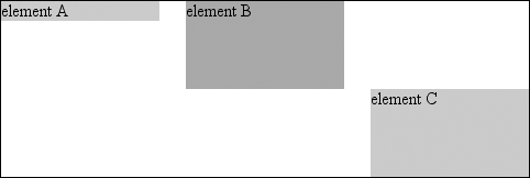
For example, the following markup results in
Figure
10-48
:
element A


element B


element C

Figure 10-48. Vertical layout behavior for absolutely positioned elements
In the first case, the height of the element was shrink-wrapped to the
content. In the second, the unspecified property (bottom) was set to make up the distance between the bottom of the
positioned element and the bottom of its containing block. In the third case, it
wastopthat was unspecified and therefore made
up the difference.
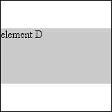
For that matter, auto-margins can lead to vertical
centering. Given the following styles, the absolutely positioneddivwill be vertically centered within its containing
block, as shown in
Figure
10-49
:
element D

Figure 10-49. Vertically centering an absolutely positioned element with auto margins