B0041VYHGW EBOK (159 page)
Authors: David Bordwell,Kristin Thompson

Duck Amuck
’s use of animation techniques is just as unconventional as its narrative form. Because the action moves so quickly, we might fail on first viewing to note that aside from the credits title and the familiar “That’s All, Folks!” logo, the film contains only four separate shots—three of which come in quick succession at the end. The bulk of the cartoon consists of a single lengthy and continuous shot—animation’s equivalent of a long take. Yet the settings and situations change quickly as the paintbrush and pencil transform the image and Daffy moves in and out of the frame. Often he appears against a stark white background
(
10.107
).
Such moments emphasize the fact that in cel animation, the figures and background are layers that could easily be photographed separately. In
Duck Amuck,
the only certain space is that of the frame itself—a quality quite different from the clearly established locales provided in more conventional cartoons.
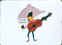
10.107 In
Duck Amuck,
Daffy is trapped without background or sound track.
Similarly, the temporal flow becomes warped as Daffy moves into and out of diegetic situations, launching into one possible plotline only to find it cut short by the mystery animator. Daffy keeps assuming that he is at the beginning of the cartoon, but time is flowing inexorably by in the outer cartoon,
Duck Amuck
itself. (Traditionally, cartoons were around seven minutes long to fit into the shorts section of movie theater programs.) At one point more than halfway through, Daffy shouts, “All right! Let’s get this picture started!” Immediately a “The End” title appears, but Daffy pushes it aside and tries to take charge: “Ladies and gentlemen, there will be no further delays, so I shall attempt to entertain you in my own inimitable fashion,” going into a soft-shoe routine against the blank background.
Duck Amuck
also plays with onscreen and offscreen space. Many of the startling transformations we witness come from outside the limits of the frame. Most important, the unknown animator occupies the space from which the camera photographs the scene, with the brush and pencil coming in from under the camera. Daffy enters and exits frequently, and the frame often moves to reveal or conceal new portions of the scenery. When the sound cuts out entirely, Daffy asks to get it back (
10.107
), and then we hear a scratchy sound, as if from a phonograph somewhere outside the frame playing a worn record. This unseen phonograph provides inappropriate noises—a machine gun when Daffy strums the guitar, a donkey’s bray when he breaks it—an elaborate joke on the fact that in animated films, the sound is never really produced by the characters and objects we see on the screen.
The most spectacular gag involving the space outside the edges of the image comes when the top of the frame seems to collapse, dripping down onto Daffy like black syrup
(
10.108
).
For a moment, we have the contradictory situation of having the space that we know should be invisible outside the frame suddenly become visible on the screen.
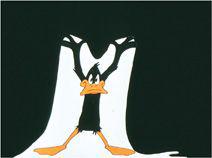
10.108 In
Duck Amuck,
Daffy struggles to preserve a bit of space for himself as the frame collapses on him.
The inventiveness of
Duck Amuck
sets it apart from more conventional Hollywood animated films. Yet it also motivates its play with the medium through its adherence to narrative form, the genre of comedy, and familiar characters (Bugs mistreating Daffy, as usual). It is possible to go even further in exploring the medium of animation and to depart from narrative altogether, as our second example shows.
Fuji
In contrast to smooth Hollywood narrative animation, Robert Breer’s 1974 film
Fuji
looks disjointed and crudely drawn. It doesn’t involve a narrative but instead, like
Ballet mécanique,
develops according to principles of abstract form.
Fuji
begins without a title or credits, as a bell rings three times over blackness. A cut leads not to animated footage but to a shaky, fuzzy shot through a train window, with someone’s face and eyeglasses partially visible at the side in the extreme foreground. In the distance, what might be rice paddies slide by. This shot and most of the rest of the film are accompanied by the clacking, rhythmic sound of a train.
More black leader creates a transition to a very different image. Against a white background, two flat shapes, like keystones with rounded corners, alternate frame by frame, one red, the other green. The effect is a rapid flicker as the two colored shapes drift about the frame in a seemingly random pattern. Another stretch of black introduces a brief, fuzzy shot of a man in a dark suit running across the shot in a strange corridor.
More black leader follows. Then, against a white background, a jagged line moves and changes shape, briefly coming together to form a crude tracing of the running man’s movement, then collapsing quickly into an abstract line and reforming into a running man. During this shot, colors shift and change rapidly.
Within this spurt of images, Breer has aroused our curiosity about what kind of film we are watching. He has also introduced most of the motifs that will be varied across the film to create its principles of abstract form. For one thing, the regular clack and hum of the train sets up a rhythm that will govern the movement on the screen. A flicker effect in which images change every one or two frames will recur through much of the film. Even when the same shape remains on the screen for a longer stretch, its color and outline often jitter in a rough rhythm.
Such attempts to avoid smooth movement and to explore the possibilities offered by different types of abstract drawings are common in experimental animation.
Fuji
is distinctive, however, in part because of its juxtaposition of live-action footage and animated images that are obviously sketchily traced from the live-action frames. Here Breer is manipulating a technique commonly used in Hollywood cartoons (and, more recently, Japanese anime):
rotoscoping
. The rotoscope is a machine used to project live-action footage, frame by frame, onto a drawing board, so that an animator can trace the outlines of the figures. The original purpose of rotoscoping was not to make the characters in the cartoon look exactly like those in the live-action film, for in fact their appearances are often quite different. Rather, a character’s movement is usually smoother and more lifelike if traced from a live model. Disney’s animated features, such as
Snow White and the Seven Dwarfs
and
Cinderella,
used extensive rotoscoping for their human characters. (Computer animation works with a similar principle but uses three-dimensional tracing and mapping.)
Breer takes rotoscoping, a technique intended to create smooth motion, and uses it in quite a different way. For one thing, he often traces only part of a figure, leaving it against a blank white background instead of tracing it onto a cel and combining it with painted scenery. In other cases, he traces the background itself rather than the moving figures, as with the train interior that appears in various colors. He also photographs his rough pencil drawings, rather than tracing them neatly onto cels in ink, as a Hollywood animator would do. By changing the color so often and by moving from image to image so quickly, Breer’s animation avoids all sense of smoothness. (Breer uses blank index cards for his drawings, deliberately avoiding the illusion of depth that cel animation can achieve.)
Most of the flickering images in
Fuji
are two frames long, and here Breer may be playing off the fact that in Hollywood cartoons of the studio era, each set of cels was actually photographed for two frames in a row, to save time and labor. In the Hollywood films, the movement still appears smooth and continuous on the screen, while Breer creates such noticeable differences between each pair of frames that the effect looks jerky.
Perhaps most daringly, Breer includes bits of the original live-action footage from which he made his tracings. As a result, we are led to see many of the images in the film
as
tracings
(
10.109
,
10.110
).
In effect, Breer has taken one of the most realistic animation techniques, the rotoscope, and used it to create a dazzling, abstract exploration of movement and perception in cinema.
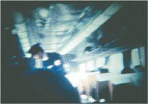
10.109 Early in
Fuji,
we see flickering images that include single frames of blurry live-action footage of the train’s interior …
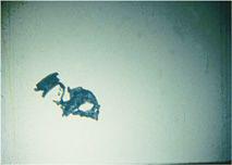
10.110 … alternating with single frames of parts of that same view in crude tracings of the conductor’s body.
The opening section of
Fuji
is based chiefly on shapes derived from train interiors. The second, lengthier section, which forms the rest of the film, begins with a stylized series of views of a mountain that we assume from the title is Mount Fuji. Again we see shifting colors and shapes, but as before, some of the footage seems to have been traced from live-action frames. The train sound continues, and as sparsely sketched buildings, bridges, poles, and fields move jerkily past in the foreground, we are likely to take this view to be one seen from a moving train—though in this case Breer does not alternate live-action and traced footages
(
10.111
).
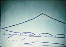
10.111 A simply sketched view of a mountain and passing bridge in
Fuji.