B0041VYHGW EBOK (59 page)
Authors: David Bordwell,Kristin Thompson

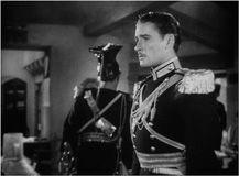
4.136 In Michael Curtiz’s
The Charge of the Light Brigade,
aerial perspective is artificially created through diffused lighting of the background and a lack of clear focus beyond the foreground character.
In
4.137
, the mise-en-scene provides several depth cues: overlap of edges, cast shadows, and
size diminution
. That is, figures and objects farther away from us are seen to get proportionally smaller; the smaller the figure appears, the farther away we believe it to be. This reinforces our sense of there being a deep space with considerable distances between the various planes.
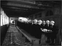
4.137 Depth cues in Straub and Huillet’s
The Chronicle of Anna Magdalena Bach.
The same illustration dramatically displays
linear perspective.
We will consider perspective relations in more detail in the next chapter, since they derive as much from properties of the camera lens as they do from mise-en-scene. For now, we can simply note that a strong impression of depth emerges when parallel lines converge at a distant vanishing point.
Off-center
linear perspective is illustrated in
4.137
; note that the vanishing point is not the geometrical center.
Central
perspective is exemplified in
4.125
from
The Draughtsman’s Contract.
All of these depth cues are
monocular,
which means that the illusion of depth requires input from only one eye.
Stereopsis
is a binocular depth cue. It results from the fact that our two eyes see the world from slightly different angles. In two-dimensional films, there is a single lens and thus no stereoptic effect. Three-dimensional cinema uses two lenses, imitating the separation of our eyes. The glasses used for viewing 3D films direct different visual information to each eye, creating a stronger illusion of depth than monocular depth cues can render. Stereopsis is a depth cue rendered by cinematography rather than mise-en-scene, though of course it involves arranging the material to be filmed in depth.
CONNECT TO THE BLOG
For our thoughts on some digital 3-D films, see “A turning point in digital projection?” at
www.davidbordwell.net/blog/?p=1419
;
“Bwana Beowulf,” at
www.davidbordwell.net/blog/?p=1669
;
and “Coraline, cornered,” at
www.davidbordwell.net/blog/?p=3789
.
In many of the examples already given, you may have noticed that mise-en-scene serves not simply to direct our attention to foreground elements but rather to create a dynamic relation between foreground and background. In
4.56
, for instance, Godard keeps our attention on the whole composition by using prominent backgrounds. Here the pictures behind the actress’s head lead us to scan the various small shapes quickly.
The
La Chinoise
shot is a
shallow-space
composition. In such shots, the miseen-scene suggests comparatively little depth, and the closest and most distant planes seem only slightly separated. The opposite tendency is
deep-space
composition, in which a significant distance seems to separate planes. Our example from
The Chronicle of Anna Magdalena Bach
(
4.137
) exemplifies deep-space mise-en-scene. Often a director creates a deep-space composition by making the foreground plane quite large and the background plane quite distant
(
4.138
).
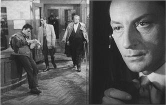
4.138 Several scenes of Wajda’s
Ashes and Diamonds
create large foreground and distant background planes.
Shallow and deep mise-en-scene are relative concepts. Most compositions present a moderately deep space, falling between the extremes we have just considered. Sometimes a composition manipulates depth cues to make a space appear deeper or shallower than it really is—creating an optical illusion
(
4.139
).
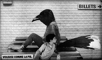
4.139 Leo Carax flattens space in
Boy Meets Girl
by making the actor in the foreground seem to blend into the advertisement on the wall behind.
At this point, you might want to return to shots illustrated earlier in this chapter. You will notice that these images use depth cues of overlap, movement, cast shadows, aerial perspective, size diminution, and linear perspective to create distinctive foreground/background relations.
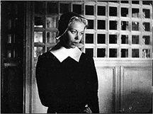
The fact that our vision is sensitive to differences allows filmmakers to guide our understanding of the mise-en-scene. All the cues to story space interact with one another, working to emphasize narrative elements, direct our attention, and set up dynamic relations among areas of screen space. We can see this interaction clearly in two shots from Carl Dreyer’s
Day of Wrath.
In the first shot, the heroine, Anne, is standing before a grillwork panel
(
4.140
).
She is not speaking, but since she is a major character in the film, the narrative already directs us to her. Setting, lighting, costume, and figure expression create pictorial cues that confirm our expectations. The setting yields a screen pattern of horizontal and vertical lines that intersect in the delicate curves of Anne’s face and shoulders. The lighting yields a patch of brightness on the right half of the frame and a patch of darkness on the left, creating pictorial balance. Anne is the meeting point of these two areas. Her face becomes modeled by the relatively strong key lighting from the right, a little top lighting on her hair, and relatively little fill light. Coordinated with the lighting in creating the pattern of light and dark is Anne’s costume—a black dress punctuated by a white collar, and a black cap edged with white—that again emphasizes her face.
4.140
Day of Wrath:
concentrating on a single figure.
The shot is comparatively shallow, displaying two major planes with little distance between them. The background sets off the more important element, Anne. The rigid geometrical grid in the rear makes Anne’s slightly sad face the most expressive element in the frame, thus encouraging our eye to pause there. In addition, the composition divides the screen space horizontally, with the grid pattern running across the top half and the dark, severe vertical of Anne’s dress dominating the lower half. As is common, the upper zone is the stronger because the character’s head and shoulders occupy it. Anne’s figure is positioned slightly off center, but with her face turned to compensate for the vacant area on the right. (Imagine how unbalanced the shot would look if she were turned to face us squarely and the same amount of space were left empty on the right.) Thus compositional balance reinforces the shot’s emphasis on Anne’s expression. In all, without using motion, Dreyer has channeled our attention by means of lines and shapes, lights and darks, and the foreground and background relations in the mise-en-scene.
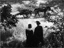
In the second example, also from
Day of Wrath,
Dreyer coaxes our attention into a to-and-fro movement
(
4.141
).
Again, the plot guides us, since the characters and the cart are crucial narrative elements. Sound helps too, since Martin is at the moment explaining to Anne what the cart is used for. But mise-en-scene also plays a role. Size diminution and cast shadows establish basic foreground/background relations, with Anne and Martin on the front plane and the cart of wood in the background. The space is comparatively deep (though the foreground is not as exaggeratedly close as that in
Ashes and Diamonds,
4.138
). The prominence of the couple and the cart is reinforced by line, shape, and lighting contrasts. The figures are defined by hard edges and by dark costumes within the predominantly bright setting. Unlike most shots, this puts the human figures in the lower half of the frame, which gives that zone an unusual importance. The composition thus creates a vertical balance, counterweighting the cart with the couple. This encourages us to glance up and down between the two objects of our attention.
4.141
Day of Wrath:
dividing attention between foreground and background figures.