B0041VYHGW EBOK (66 page)
Authors: David Bordwell,Kristin Thompson

Jean-Luc Godard’s
Les Carabiniers
(
5.4
)
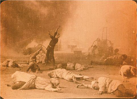
offers a good example of what post-filming manipulations of film stock can accomplish. The shot’s newsreel-like quality is heightened by both the film stock and lab work that increased contrast. “The positive prints,” Godard has explained, “were simply made on a special Kodak high contrast stock…. Several shots, intrinsically too gray, were duped again some-times two or three times, always to their highest contrast.” The effect suggests old combat footage that has been recopied or shot under bad lighting conditions; the high-contrast look suited a film about the grubbiness of war.
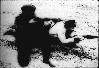
5.4 This shot from
Les Carabiniers
achieves a newsreel-like quality heightened by both the film stock and lab work that increased contrast.
Different color film stocks yield varying color contrasts. Technicolor became famous for its sharply distinct, heavily saturated hues, as seen in such films as
Meet Me in St. Louis
(
5.5
).
The richness of Technicolor was achieved by means of a specially designed camera and sophisticated printing process. To take another example, Soviet filmmakers used a domestically made stock that tends to lower contrast and give the image a murky greenish-blue cast. Andrei Tarkovsky exploited just these qualities in the monochromatic color design of his shadowy
Stalker
(
5.6
).
Len Lye’s abstract
Rainbow Dance
uses specific features of the English stock Gasparcolor
(
5.7
).
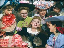
5.5 The trolley scene in
Meet Me in St. Louis
shows off the vivid colors possible with the Technicolor process.
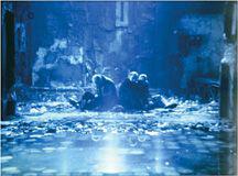
5.6 The use of blues in
Stalker
makes the action seem almost to be taking place underwater.
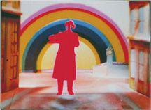
5.7 Lye manipulated Gasparcolor paper stock to create pure, saturated silhouettes that split and recombine in
Rainbow Dance.
The tonalities of color stock may also be altered by laboratory processes. The person assigned the role of
color timer
or
grader
has a wide choice about the color range of a print. A red patch in the image may be printed as crimson, pink, or almost any shade in between. Often the timer consults with the director to select a key tone that will serve as a reference point for color relations throughout the film. Increasingly, cinematographers are using computer grading for selected shots or even an entire film. (See
“A Closer Look,”
pp. 184
–185.)
Certain procedures may also add color to footage originally shot in black and white. Before 1930, filmmakers often used tinting and toning.
Tinting
is accomplished by dipping the already developed film into a bath of dye. The dark areas remain black and gray, while the lighter areas pick up the color
(
5.8
).
Toning
worked in an opposite fashion. The dye was added during the developing of the positive print. As a result, darker areas are colored, while the lighter portions of the frame remain white or only faintly colored
(
5.9
).
5.8 Tinting creates a brownish color across the entire frame in the 1914 film
The Wrath of the Gods.
5.9 In
Cenere,
the deep blue of the dark areas and the nearly white patches are characteristic of toning.
Certain conventions grew up around tinting and toning. Night scenes, as in
5.9
(from
Cenere,
a 1916 Italian film) were often colored blue. Firelight was frequently colored red, while interiors were commonly amber.
The Wrath of the Gods
(1914) uses a brown tint to suggest the glow of an erupting volcano (
5.8
). Some later filmmakers revived these processes. Vera Chytilova employs a crimson toning in
Daisies
(
5.10
).
5.10 Toning in
Daisies.
A rarer method of adding color is the difficult process of
hand coloring.
Here portions of black-and-white images are painted in colors, frame by frame. The ship’s flag in Sergei Eisenstein’s
Potemkin
was originally hand colored red against a blue sky. A modern use of hand coloring may be seen in Makavejev’s
Innocence Unprotected
(
5.11
).
5.11 In
Innocence Unprotected,
stylized images are created by painting multiple colors within a shot.
There are many other ways in which the filmmaker can manipulate the image’s tonalities after filming. In
Reflections on Black,
Stan Brakhage scratched off the emulsion in certain parts of the shot
(
5.12
).
Lars von Trier shot
Breaking the Waves
on 35mm film, then transferred the footage to video and used digital manipulation to drain out much of the color. He transferred the footage back to film, resulting in desaturated images that tremble and shimmer (
5.2
).
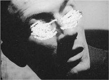
5.12 By scratching the emulsion, Brakhage emphasizes the eye motif that runs through
Reflections on Black.