Building Web Sites All-in-One For Dummies® (62 page)
Read Building Web Sites All-in-One For Dummies® Online
Authors: Claudia Snell

Exporting Artwork from Fireworks
After you optimize the image, it's time to export it from Fireworks. Exporting images is fairly straightforward; choose FileâExport and then specify the folder in which to save the image. When you export a document like a navigation menu with multiple slices, you export the document as images and HTML as follows:
1.
Choose File
â
Export.
The Export dialog box appears.
2.
Choose HTML and Images from the Export drop-down menu.
This option exports the document as an HTML file with all the code necessary to reassemble the exported images, create links for navigation menus, and so on.
 When exporting a JPEG image, choose Images Only. Normally this is selected by default when you're exporting an image without slices or hotspots.
3.
Choose Export HTML File from the HTML drop-down menu.
Your alternative is to copy the HTML code to the Clipboard.
4.
Select the Include Areas without Slices check box.
This exports the areas of your document such as the background that has not been designated as a slice.
5.
Click the Put Images in Subfolder option.
This helps keep your files neat and tidy. By default, Fireworks creates a folder named Images. You can specify another folder by clicking the Browse button and then navigating to the desired folder.
6.
Click Save.
Fireworks exports the document (as an HTML file) and images to the specified folders.
Chapter 4: Creating Compelling Graphics
In This Chapter
Creating site banners
Creating compelling graphics
Using Web-friendly photos
Incorporating Web photo galleries
Almost every Web site you see has graphics. Face it â a Web site without graphics is text. And how boring is that? To make the sites you design stand out among the plethora of sites on the Web, you need to incorporate fast-loading, compelling graphics. Graphics come in many flavors. Some of them we covered in the preceding chapter of this minibook. In this chapter, we discuss the graphics that elevate the sites you design above the competition. These include such graphic elements as the banner, splash images, and photo galleries. When you create these elements, you incorporate your own design preferences with the graphic elements from your client's brick-and-mortar business if he has one.
Creating Banner Graphics
Banners are proudly displayed at the top of just about every Web site you visit. The banner often incorporates the client's marketing tools, such as the company logo. When you create a banner for a site, you use the company logo and a color scheme that's harmonious with your client's logo. If your client doesn't have a logo, you use your own sense of design to create the color palette for the site.
Using Photoshop to create a banner
You can create a banner in just about any image-editing application that enables you to create a document from scratch. Photoshop, however, gives you the power to augment your creativity with its rich feature-set. Photoshop ships with a set of Adobe Pro fonts that give you the capability to create a very unique banner.
When you design a banner, your first consideration is size. Your client's logo â if she has one â is nestled in the design. Therefore, the banner must be tall enough to prominently display the logo. Fortunately, most professionally designed logos look good in sizes from the sublimely small (the customer's letterhead) to the ridiculously large (a billboard ad). If the client's logo already has text, the logo and a harmonious background color are all you need. If the client logo displays only an artistic arrangement of the client's initials, you have to add text. As a rule, centering banners and site content is preferable.
When you decide on the size for your banner, you must take into account the amount of available monitor real estate for the desktop size of your client's intended audience. A good practice is to optimize Web graphics for the lowest common denominator, which is currently 800 x 600 pixels. In order to keep all your content above the fold, you have to deal with an area of 760 x 420 pixels, which is all you have left after browser toolbars, menus, scroll bars, and so on. Therefore, the maximum size of any banner you create should be 700 x 120 pixels. This leaves you room for a navigation menu, images, and text.
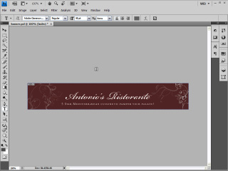
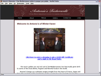
Figure 4-1 shows a simple banner being designed in Photoshop. The banner is text-only because the business being promoted on the Web site is a restaurant that didn't have a logo when the initial site was being designed. The banner size is 720 x 120, large enough to elegantly display the company name in Edwardian Script font and the tag line in Adobe Garamond Pro font. The text for the tag line was further formatted using the Photoshop Character panel, which enables the designer to incorporate font styling such as small caps, faux bold, and faux italic. Faux bold and italic are especially useful if the desired font face does not come with bold or italic styling options. Figure 4-2 shows the banner as displayed on the client's Web site.
Figure 4-1:
Designing a simple banner in Photoshop.

Figure 4-2:
The banner incorp-orated with the Web design.

Including all the important information
The size of your banner is determined by the amount of information your client wants to display. Sometimes your client goes over the top and asks you to include everything but the kitchen sink: for example, the name of the company, address, phone number, Web site URL, and so on. That's simply way too much information, and why most Web sites include a Contact Us page. In reality, all a banner needs are the following elements:
â¢
Client logo:
If your client has a logo, it should be displayed prominently on the banner. Logos aligned to the left side of the banner look good.
â¢
Company name:
If the client's logo doesn't display the company name, add the company name to the banner. If you're designing a banner for a client who doesn't have a logo, place the company name or Web site name on the banner, centered. When designing a banner for a client with a logo but no company name, display the logo on the left with the company name immediately following. Leave enough space so that the banner does not look cluttered.
â¢
Tag line:
If the company has a tag line, display it below the company name. A tag line is a sentence usually less than ten words that describes what the company does. For example the tag line for Doug's wedding and event photography company Superb Images is: “Creating superb images of memorable moments.” If the client has a logo with a company name, the tag line is displayed to the right of the logo, centered vertically. If the company has a logo without a company name, the tag line is centered below the company name. The logo is sized to fill the height of the banner.
Working with an existing logo
When you design a banner â or, for that matter, a Web site â your client's logo plays an important part in the overall design. If the logo is well designed, you can incorporate elements from the logo into your design. The banner and the Web site should include colors from the client's logo. Figure 4-3 shows a logo being incorporated into a banner design in Photoshop. Figure 4-4 shows the banner incorporated with the Web design. If this book were in color, you'd be able to see that the site colors were pulled directly from the client's logo.
Figure 4-3:
Incorporate a client's logo with a banner design.

Figure 4-4:
Incorporate the banner with the site design.

Create Promotional Graphics
In today's business climate, a Web site often drives a small business. Therefore, the site often comes before any printed material is created to promote the business. When this is the case, it's logical to use elements from the site design to promote the business. For example, when Doug designed a Web site to promote his photography business, he originally started out with an artistic photo of a very vexing set of eyes. He changed the splash image after doing a ten-minute presentation for a local networking group. He showed a print of an image he stylized in Photoshop. The image was originally in color, but he converted it to black and white and painted some color from the original image into the subject's lips and eyes. The photo received a lot of oohs and aahs, so Doug now uses it on his home page. (See Figure 4-5.) This photo also appears in Doug's promotional materials. When recipients of the printed material visit the Web site, they immediately see a familiar face.
Figure 4-5:
Use Web site elements for promotional items.

Emphasize your point
When Doug decided to create promotional materials to increase his photography business, he knew that the Web site would play an integral part in his marketing plans. When he embarked upon a local marketing campaign, he started with postcards. The front of the postcard features the image from the home page. (See Figure 4-6.)
Even though Doug did all the design work for his printed material, he consulted a marketing specialist when deciding what to emphasize on the postcard. She suggested emphasizing a particular service instead of listing all his services. Doug specializes in portrait photography on location. Therefore, he decided to focus on that aspect of the business in the first printed material he created. He laid out the back of the postcard in Adobe Illustrator, using bullet points to bring attention to his portrait photography service. He also added a
call to action
on the back of the card. A marketing guru had told him to give recipients a reason to call. The card has contact information including, of course, the URL to the section of Doug's site where recipients can find examples of his portrait photography. And, of course, his tag line appears below the company name (see Figure 4-7), just as on the Web site.
Figure 4-6:
Incorporate design elements in printed material.
