Read The Universal Sense Online
Authors: Seth Horowitz
The Universal Sense (6 page)

Careful listening for even a short period of time not only reveals the wealth of sound sources that surround us but can give us profound insights into both how space shapes sound and how the brain handles the remapping of sound into a psychophysical representation of the space we occupy.
The walk I’ll describe here took place about 2:30 P.M. on a Sunday afternoon in late October several years ago, a clear day with a temperature of about 60 degrees, with very light winds. My wife and I took a walk through New York’s Central Park; for you non–New Yorkers, Central Park is closed to most vehicular traffic on the weekends and hence is full of people riding bikes, skating, running, playing musical instruments, or trying to pretend they are wandering through some pastoral utopia complete with hot-dog vendors. We recorded the walk as part
of a project of hers in urban bioacoustics. My wife was wearing in-ear binaural microphones attached to a portable digital sound recorder. In-ear binaurals are tiny specialized microphones that cover the human auditory range pretty well, from about 40 to 17,000 Hz, and fit into the ear canal, pointing outward. What makes recordings from these microphones unique is that since they sit inside the ears, they pick up sounds exactly the way your ears do, using the individual shape of your ears to create subtle changes in the waveform and spectra of sounds entering your ears. They also are wonderful for capturing subtle differences between the sounds that enter each ear individually. To set the stage, my wife and I, who are five foot six and five foot eight, respectively, were walking northbound along the asphalt road just west of the Metropolitan Museum of Art, with her on the right, closer to the roadway, and me on the left nearer the grass. You’ll soon see the reason I provide this level of detail.
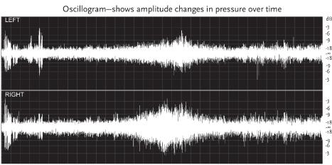
Although we walked for about an hour, we’re only going to examine about 34 seconds’ worth of the recording. Figure 1 shows two graphs, each divided into two channels, the left channel (from the left ear) at the top and the right channel (from the right ear) on the bottom. The graph at the top is called an
oscillogram
and shows the changes in sound pressure measured in decibels (dB) on the vertical axis, over time in seconds on the horizontal axis. The oscillogram is a standard tool for analyzing the change in strength of the overall signal over time, as well as identifying changes in the fine structure of a signal’s waveform when a higher resolution (and thus shorter time sample) is used. Because this particular example covers about 34 seconds, it does not show the individual changes in the waveform that make up its fine structure, but only shows relatively gross changes in amplitude, called the sound’s
envelope
. The envelope alternates
above and below the center line (marked with - ∞). This particular recording was set so that the amplitude range went from 0 to 90 dB SPL, with 90 dB being approximately the loudest sound that could be recorded and any sound under 0 dB being too quiet for the microphone to pick up.
3
The center line (the
zero crossings
of the waveforms) is listed as - ∞ because it represents a complete lack of acoustic energy, a situation you are not going to run into without a lot of liquid hydrogen to cool things down to near absolute zero.
The lower graph is called a
spectrogram
, and it shows changes in the amplitude of specific frequencies over time. Even though it is derived from the same sounds as the oscillogram, it shows different details about the sounds. The horizontal axis shows time, aligned with the oscillogram above, going from the start at the left to about 34 seconds at the right. The vertical axis is labeled with different frequencies, starting here at 0 and going up to about 9,000 Hz. While the recording went up to 17,000 Hz, this particular spectrogram has been truncated since most of the sound energy of interest was lower than this point, and it also makes it easier to see details. In the graph, black indicates no acoustic energy, so every lighter colored point indicates a place where that particular frequency was detectable, and the higher the amplitude, the lighter the color. In listener’s terms, a white horizontal line halfway up the graph meant that there was a loud tone of 4,500 Hz playing for the duration of the length of the line. Since the spectrogram shows frequencies discretely, rather than lumping them all together into a measure of the amplitude of all frequencies at a given time (as the oscillogram does), it lets you both detect individual acoustic events and identify their frequency content more easily.

Let’s start our auditory walk with a couple of basic features about the soundscape. You’ll notice that the gross envelope of the sounds on the oscillogram never seems to drop lower than about -15 dB. Compare that to the gray band on both channels of the spectrogram (slightly denser on the right), which covers the
entire recording from about 2,000 Hz down toward 0. The band is almost even in density in the spectrogram, meaning that the acoustic energy is about equally distributed up to 2,000 Hz. This is a
noise
band. If we were recording in a quiet wooded or grassy area, far removed from a city, both the level and frequency would drop but not disappear. Acoustic background noise is present in any environment, and hence you almost never pay attention to it, except to subconsciously raise your voice a bit to talk or turn up the volume on your music. This background noise is based on thousands of blended sources, including voices, wind, and traffic noises, all at a distance, but contributing to a general, undifferentiable susurration. But one of the major contributors to this low-frequency noise band is ground traffic. The speed of sound varies with the density of the medium, and packed dirt, asphalt, and concrete are all dense enough to increase the speed of sound to up to ten times what it is in air. This means that sounds will travel through the ground up to ten times farther away before fading away compared to air. While an individual footstep, moving car or bicycle tire, or dropped package would probably make a truly noticeable noise only within 125 feet or so of a listener, because of the ground’s higher propagation speed, you are suddenly having all sounds from within almost a quarter-mile radius all adding together, bouncing off the top and bottom of the roadway, interfering with each other, reverberating along the entire continuum of the solid earth, and using the ground surface itself as a giant, low-fidelity speaker. This also explains why the noise density (the brightness on the spectrogram) is higher on the right channel than the left, as my wife’s right ear faced the roadway and her left ear faced the grassy area.
One thing I’ve noted in my travels is that every city has its
own background noise signature. The in-air sounds vary based on the number of people, animals, or other noise generators in the area at any given moment. What differentiates the background noise of one locale from another seems to be based on the materials and density of roadways. The sound of cars driving over concrete is quite different from the sound of them driving over asphalt, and even the different compositions of asphalt found in different places can make the ground-based background noise perceptibly different if you pay attention. As mentioned earlier, Venice, Italy, despite being filled with thousands of tourists, is one of the quietest cities, due both to a lack of car traffic and to the common use in building facades of porous limestone, whose structure acts as a natural acoustic damper.
Let’s examine some more specific features visible in the figure. If you look at the oscillogram, for the first four seconds there are several loud peaks, starting with approximately equal peaks in the left and right channels, followed by sounds that are louder on the left than the right. This is my wife’s voice, followed by my voice. The higher amplitude of her voice is not because she is shouting, but rather because her voice is closest to the microphones in her ears, and also because the sound is not just traveling out of her mouth to the microphones in her ears but traveling internally as well, through her skull, using a sound pathway called
bone propagation
. The later peaks, starting at about 3.5 seconds, are from my voice, and are higher-amplitude on the left because I am speaking from her left side. If you look at the spectrogram, you will get more details that reveal a great deal about human speech acoustics. The spectrogram of her voice shows a series of bright white lines arranged vertically into bands that change slightly in position over time. These are harmonic bands, levels of similar frequency energy separated by
null areas. The specific harmonic structure of these bands is defined by her vocal tract. She is saying, “We’re behind the Met Museum,” and the changes in the direction of the frequency bands indicate changes in the frequency of her voice as she switches between vowels and consonants. These changes in the frequency bands are called
formants
and identify the basic acoustics of human speech sounds. Notice that the bands in her voice (up to about 2 seconds) extend in a layer up to about 6,000 Hz on both sides, getting brighter in the lower frequencies, whereas those in my voice only go up to about 4,000 Hz and are brighter on the left channel (where her ear is facing me) than on the right, with almost nothing that appears to go above 3,000–4,000 Hz on her right. This is a demonstration of the sound shadow created by my wife’s head, which limits sounds above about 4,000 Hz from wrapping around her head to the other ear. I am saying, “We’re on Museum Drive North.” If you look closely at the harmonic bands from my voice at around 4 seconds, you can see that not only does most of the energy from my voice stay lower than hers (except when saying the “D” and “th,” speech sounds that have a lot of noise in them) but the bands are closer together. These two factors are what define my voice as having a lower pitch than hers. It’s not just the top end of the frequency range but also the spacing between the harmonic bands that help your ears decide on the pitch of a sound.
Another clear feature that is present almost from the beginning and shows clear left/right differences are the two fairly bright lines at the top of the spectrogram at about 6,000 and 7,000 Hz. If you look closely, you can see that these bands are made of very tightly packed vertical white lines repeating almost continuously for the entire duration of the sound. These are insect sounds (probably from cicadas) sitting in the trees in the
grassy area to the left as we walked. These are also a serious contributor to the constant background amplitudes in the oscillogram, but notice once again how limited the sounds seem in the right side, the ear facing away from their source, as their high frequencies are masked by my wife’s head. The only time they really show up in the right-hand channel is from about 10 to 12 seconds, when we are passing a very tall tree that is the probable location of our singing bug.
As we continue our walk, the next obvious event is a small, almost vertical dash at about 9 seconds and about 3,000 Hz. This is a chirp from a small bird off to the right across the roadway. It barely makes an additional peak on the oscillogram, even though you can clearly differentiate it from the background noise with your ears and by looking at the spectrogram. However, there is a deeper story to this simple call. If you examined that part of the spectrum in greater detail, you’d spot another small blip in the spectrogram at about 1,500 Hz, making the 3,000 Hz signal a harmonic band. However, the lower band is in the region of the background noise and hence is almost invisible. This has some important implications for animal communication, as birds that live in the city have to contend with this background noise fairly constantly. It’s been shown in several recent studies that birds living in urban environments have to shift their calls so that they are audible above background noise, which results in some interesting changes in behavior and stress levels for our avian neighbors (just as it does for us).
At about 12 seconds, both the oscillogram and the spectrogram show a brief increase in amplitude; the spectrogram reveals mostly high-frequency noise with faint bands in it. This is the sound of a bicycle changing gears as it passes us on the right in the roadway; the low-frequency (and relatively low-amplitude)
sounds of the wheels on the asphalt are not detectable amid the background noise. But compare this to an event that starts at about 14 seconds in the oscillogram and continues until about 20 seconds. The sound builds up quickly, again particularly on the right side, and then peaks somewhat later on the left side. When you look at the spectrogram, you see a similar pattern, but the sound is quite dense all the way up to about 8,000 Hz, peaking on the right at about 17 seconds and the left at about 19 seconds. This sound came from a service truck driving slowly northbound on the asphalt. The difference between the left and right channels and in the shape of the spectrogram and oscillogram tells the complete story of this movement, with the sound detected first on the nearer side and peaking in amplitude as it passed the right-ear microphone, but partially blocked by the sound shadow of my wife’s head until it is in front of her on the right, when there is a clear path for the higher-frequency noise to her left ear.