A Companion to the History of the Book (88 page)
Read A Companion to the History of the Book Online
Authors: Simon Eliot,Jonathan Rose

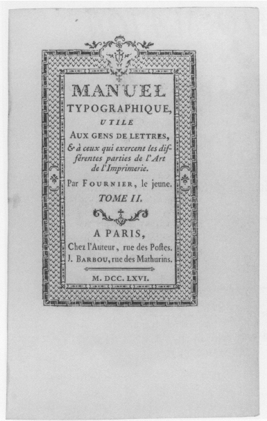
The first major English printers to influence Western typographic art emerged in the eighteenth century. Following William Caslon’s sturdy, almost rustic type designs of the 1730s, maverick William Baskerville offered new roman and italic types that were precise and statuesque, and pages that dazzled contemporaries’ eyes with radiant space around and between letters, as if the paper were a pedestal for the type alone. Although too extreme for many English book connoisseurs of his own day (his editions took years to sell), Baskerville’s work helped inspire the most influential design figure of the late eighteenth and early nineteenth centuries, Giambattista Bodoni of Parma. In the cool precision of his austere, supremely formal types and typography, Bodoni blended a neoclassical aristocratic arrogance with the promise and power of the dawning industrial age.
Figure 36.2
Pierre-Simon Fournier,
Manuel typographique
(Paris: Joseph Gérard Barbou, 1766).

As the nineteenth century progressed, however, the bookmaking trades were swept up in the great industrial transformations of the era, particularly when steam power was harnessed to replace human labor in both papermaking and printing. The new Fourdrinier machine replaced handmade sheets of rag-based paper with far more plentiful and less costly rolls of paper made from wood pulp, while new steam-powered printing presses yielded thousands of pages per hour, far more than the two to three hundred sheets skilled printers could produce in an hour using a traditional hand press (whose design had changed little from Gutenberg’s day).
Just as fifteenth-century technology had altered the aesthetics of bookmaking as well as its economics, so in the nineteenth century the new plenitude of books and other printed matter was accompanied by a marked change in their look and feel. Machine-made papers were often distinctly less durable and crisp than handmade sheets, and they lacked the latter’s telltale fine irregularities and feathery deckle edges. Machine-printed books were printed from types whose letterforms had been slightly compressed to better endure the stress of the high-speed action and with inks thinned to enable the presses to run more smoothly. Moreover, new mechanical engraving technologies could achieve the elaborate, ornate typography and ornamentation that delighted Victorian book enthusiasts.
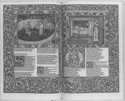
Near the end of the century, however, in the wake of the Arts and Crafts Movement in England, the nearly dormant handcrafts of bookmaking experienced a dramatic revival. Led by writer, artist, and social visionary William Morris and his private Kelmscott Press, a small but influential group of printers and publishers rekindled interest in and appreciation for preindustrial bookmaking aesthetics and techniques, which in their modern guise soon became known as
fine printing.
Morris and others vigorously denounced machine-made books as anemic and sterile, both for their typically pale, grayish texts and for the capitulation of human skill and judgment to mechanical expedience. Paying zealous attention to details of design and handcraft, the early private presses (private in that they were governed by personal values rather than commercial considerations) demonstrated the forms that they believed the “ideal book” should aspire to, turning to models from earlier golden eras of typographic mastery. The Kelmscott Press evoked the robust and decorative late medieval German style (
figure 36.3
), while the Ashendene and Doves presses preferred the more pristine beauty of Italian Renaissance typography. These and other influential private presses sparked an eager resurrection of historic typefaces and preindustrial design values that resonate throughout most of the great fine-printing achievements of the early twentieth century. The American master of so-called “allusive” typography, Bruce Rogers, designed books that recreated the style and spirit of earlier eras, from the Renaissance through the eighteenth century.
Turn-of-the-century artists and writers on the continent also rebelled against sterility and complacency in Victorian book design; however, they sought inspiration not from the past but from the swiftly changing political, economic, and industrial conditions of the new century. Avant-garde artists in France, Italy, Germany, and Russia linked to the Dada and Futurist movements in modern art, including Filippo Marinetti and Wassily Kandinsky, boldly championed a new aesthetic based on the streamlined precision, universality, and elemental starkness of modern technology, rejecting traditional notions of beauty as decadent and frivolous. In 1928, a young Jan Tschichold at Germany’s Bauhaus school of design articulated the call for a modernist “new typography,” advocating sans serif types, asymmetrical layouts, and abstract geometric visual elements for dynamic coherence. While modernist principles have profoundly influenced worldwide graphic design – governing magazine and advertising typography, signage, and other public and commercial forms of print – historicized traditional values remain predominant in most Western book typography. Tschichold himself later renounced his strident modernist stance: his redesign of the Penguin paperback in the late 1940s remains a paragon of twentieth-century traditional book typography.
Figure 36.3
Geoffrey Chaucer,
Works
(London: Kelmscott Press, 1896). Designed and decorated by William Morris, with illustrations by Edward Burne-Jones.

Finally, bindings have long represented a particular vein of bookmaking artistry. For centuries, most books were sold unbound, their pages typically folded and gathered into temporary wrappers; purchasers hired bookbinders to house them in permanent covers, providing an opportunity to embellish a treasured book with ornamental patterns stamped into the leather and even embedded with precious metals and jewels. Legendary sixteenth-century French bibliophile Jean Grolier was one of the first to focus particular attention on bindings: he commissioned spectacular works executed with intricate designs, often in gold or silver. In the nineteenth century, as publishers began selling most books bound in machine-made covers, unique “designer” bookbinding emerged as an independent modern art form, commissioned by wealthy collectors and institutions for their most elite copies of valued books. Modern designer binders like Paul Bonet, Philip Smith, and Angela James have elevated the craft into a rarefied art form, creating bindings of fine leathers and precious materials composed in interpretive designs inspired by the book’s content but expressing the binder’s own creative vision.
From the earliest efforts to endow the pages with beauty and power, bookmakers often included images. Ancient Egyptians were among the first to add friezes of imagery to their books, typically a swathe of stylized human and animal figures poised above or beneath the columns of text spread across the scroll. A few scrolls feature images interjected into the text area, remarkably prefiguring modern page design that integrates text and imagery.
Medieval manuscript books were also frequently adorned with images. Added by artists after scribes had copied the text, historiated initials (for example) depicted figures or scenes within large and often elaborate capital letters. Images incorporated into decorative borders and embellishments surrounding the text brought visual messages of their own, sometimes at odds with the messages of the texts, often including human figures or fantastical creatures performing familiar activities or cavorting in outlandish behaviors. These images, part of a widely recognized symbolic vocabulary, were often more “read” than the formal Latin text.
This imagery was considered part of the larger didactic or embellishment scheme, rather than illustration in the modern sense. Even miniatures, or original small paintings included in the most extravagant of medieval manuscript books, were intended more to add beauty to the book than to provide an artist’s particular interpretation of the text. Depicting not only biblical or religious scenes but also secular subjects, including landscapes, historical events, daily life, and portraits of the book’s owner, miniatures were commonly included in lavish copies of Books of Hours produced for European nobles.
As discussed earlier, the nature of art in books evolved dramatically with the Renaissance and the advent of printing. On one hand, images in printed books lost much of the prestige that was accorded the artwork in manuscripts. As Walter Benjamin would famously put it nearly five hundred years later, art reproduced in multiples from woodcuts lacked the “aura” that animated original art direct from the hand of the artist (Benjamin 1969). On the other hand, print enabled a veritable explosion in the sheer number and variety of images, and gradually but significantly expanded the presence of images and art for all readers, not merely the wealthiest few.
Moreover, as humanism placed new value on the capacity of the human imagination, intellect, and talent, artists began to participate more centrally in the making of books. Although many books included some form of visual imagery on their pages, in only a few did the caliber and prominence of that imagery rise to a noteworthy level. An early example is the 1486 edition of
Peregrinations in montem Syon
(Travels in Mount Syon) printed in Mainz and illustrated with woodcuts by Erhard Reuwich. Norma Levarie credits Reuwich’s work as the first to have “a truly modern spirit” (1968: 103). The woodcuts accurately depicted the contemporary natural world (Reuwich traveled with the author in order to illustrate the geography, architecture, and peoples of the lands visited) and, more importantly, the edition boldly featured Reuwich’s art in its own right. For the first time, the artist was named in the edition, and the images were printed on a generous scale, including some as foldouts, extending as much as five feet.
Albrecht Durer was among the first book illustrators also to enjoy an undisputed reputation as a major artist. At times, his work so dominated the edition that the text seemed merely an excuse for producing the art, provoking the tension between text and image that continues to trouble text-centered sensibilities today. Other sixteenth-century artists of major stature who also illustrated books include Hans Holbein, working in Basel and Lyon, and Lucas Cranach and his son Hans in Germany. They brought to books the same expressive and interpretive talents that made their paintings and other work so prized, helping to elevate the status of illustration as an art form in its own right.
In the following centuries, a few major artists similarly illustrated books as part of their repertoire. In the 1630s, Frenchman Jacques Collot was one of the first to debut the new technique of etching, exploiting its capacity to render sketch-like lines and subtle shading. When lithography was developed nearly two centuries later, Eugène Delacroix was among the first to exploit its rich, continuous-tone qualities in illustrations for an 1828 edition of Goethe’s
Faust.
The prolific, romantic Gustave Doré soon followed, illustrating many editions of literary classics with dramatic wood engravings, often dark and brooding.
Particularly in France, the practice of pairing fine art illustrations with literary texts reached a grand and costly scale in the late nineteenth century. Yet a restless dissatisfaction began to stir in some quarters, especially in light of the English fine-printing revival of preindustrial bookmaking aesthetics discussed earlier. Some chafed at the usual practice of inserting plates of illustrations at intervals throughout the text (since they were printed separately, using different processes), so that text and illustration were rarely designed to work together in any meaningful way. By contrast, fine printers preached close integration of the textual and visual aspects of bookmaking, urging balance and coherence across facing pages.
In 1900, Ambroise Vollard gave those principles a distinctly French flavor when he published Paul Verlaine’s
Parallèlement
with lithographs by Pierre Bonnard. This landmark work launched a new genre, the
livre d’artiste,
in which imagery was deemed as important a factor in a book’s design as its text. Softly rendered and printed in pale inks, Bonnard’s illustrations settled comfortably across facing pages, surrounding the elegantly simple italic poems. Visually inseparable, image and text were perfectly married. Supported mainly by elite clubs of wealthy bibliophiles, the
livre d’artiste
flourished in the early decades of the twentieth century. An all-star array of modern artists participated, including Picasso, Chagall, Matisse, Maillol, and Dufy, and the books that resulted are now often as rare and valued as their other works.